Startup Bootcamp, Part 11: Build a Landing Page
We’re going 0 to 100, real quick.
Did your idea crush it in your initial market feedback exercise? Great, you’re ready to launch your product, rent office space and hire a few employees! Oh, wait; what that really means is you’re ready to expand the number of people exposed to your idea to 100 without spending a fortune. Enter the landing page MVP. We identified popular types of MVPs earlier in this guide but we highly recommend developing a landing page in addition to the MVP most appropriate for your concept. As we’ve mentioned no less than 30 times (sorry, not sorry), the goal of the MVP is to quickly get customer feedback and iterate based on feedback. The landing page is the easiest way to avoid wasting valuable time and money on an idea that isn’t worth it.
Why you’re doing it
The goal of the landing page is to get your idea in front of 100 people quickly and affordably. You want to get to the “Why.” What do we mean by that? Glad you asked:
Getting quantitative metrics. Remember your minimum criteria for success metrics? They are cost per acquisition and % positive feedback. How are these numbers stacking up after 100 eyeballs? Do you have 100 views and no sign ups? Now is the time to find the flaw in your assumptions and make adjustments.
Getting feedback beyond the numbers. Try to move beyond the numbers to a 1:1 conversation. You want real market feedback and input on your concept from as many people as possible.
What’s involved
A successful landing page has three (and only three) components:
Headline. Keep it benefit-focused, relevant and succinct.
Call to action (CTA). What do you want people to do? Get updates? Stay informed? Pre-order now? At this stage, you want to collect contact information so you can follow up; a prominent email entry is recommended.
Features and benefits. A feature is what your product does; a benefit tells your customer what it means to them. This landing page should contain a simple explanation of services to entice action, and why they should care.
How to build it
There are a number of tools that make the development of a landing page a lot less daunting. Below are some resources to go from 0-100 quickly:
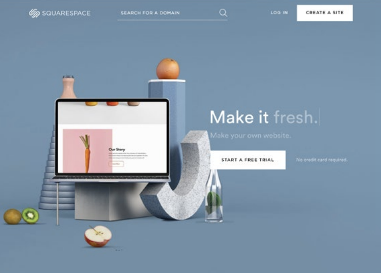
Instapage, Squarespace and Wix are intuitive, and easy-to-use content management systems (CMS). Instapage is perfect for setting up a page quickly to acid test, whereas Squarespace and Wix are more robust CMS tools. Pick your poison.
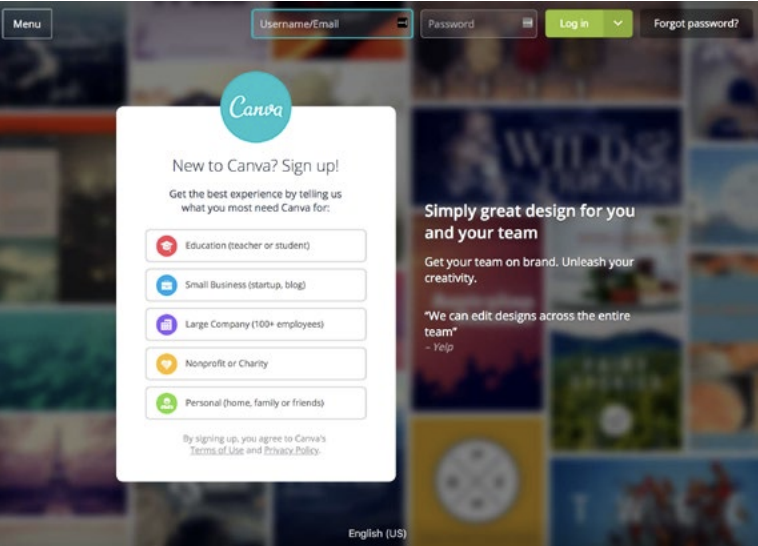
Canva makes it easy to develop a color palette, format photos and create font combinations for whatever piece of content you need, from a website header graphic to a social post. Their built-in templates take the guesswork out of it.
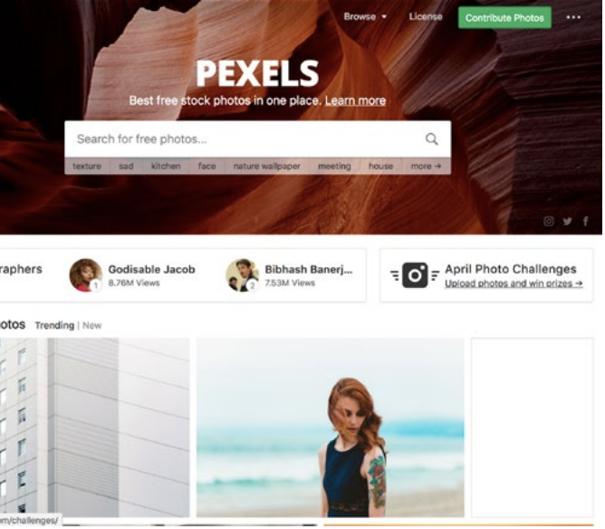
Most stock photos suck. But unless you’re a professional photographer, great imagery may not be easily accessible. It’s OK to cheat with something like Pexels. They provide higher quality stock photos that don’t look like stock photos. Other great websites include deathtothestockphoto and unsplash.
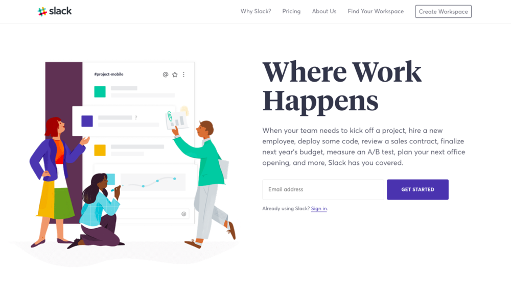
What comprises a good landing page? Slack is one of our favorites, and here’s why:
It clearly states Slack’s benefits The call to action is clear, prominent and in several locations
The copy is succinct and doesn’t beat around the bush
Its visuals are consistent with Slack’s advertising, social and video content, so visitors know what to expect when they arrive
Trying Slack is free; there are few barriers to signing up
The landing page asks for an email address. That’s it. No unnecessary questions or data collection here
The content isn’t peppered with confusing jargon. If you’re a developer or an art director, you’re pickin’ up what Slack is puttin’ down
We applied these best practices to Primal Post’s landing page. How did we do?
Primal Post’s value proposition is above the fold The call to action is clear (and cute)
The body copy clearly states what Primal Post does and why they should care
The visuals on the landing page are consistent with the “thanks for signing up” email they receive after entering their information
Primal Post offers a “meat lover’s promise” to their customers. If they aren’t happy with their jerky, they will be refunded The landing page asks for their name and email address
The copy speaks to our jerky-loving target audience
